FITAID Packaging Redesign
Packaging Design, Brand System Design, Art Direction
THE PROBLEM
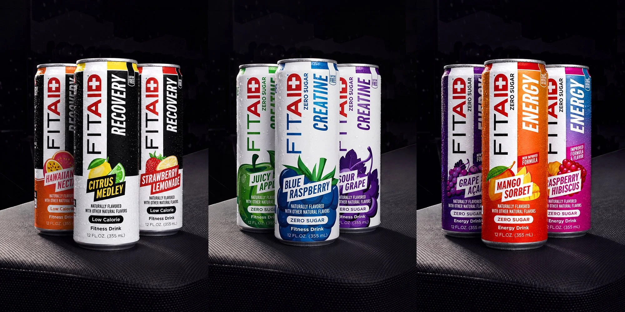
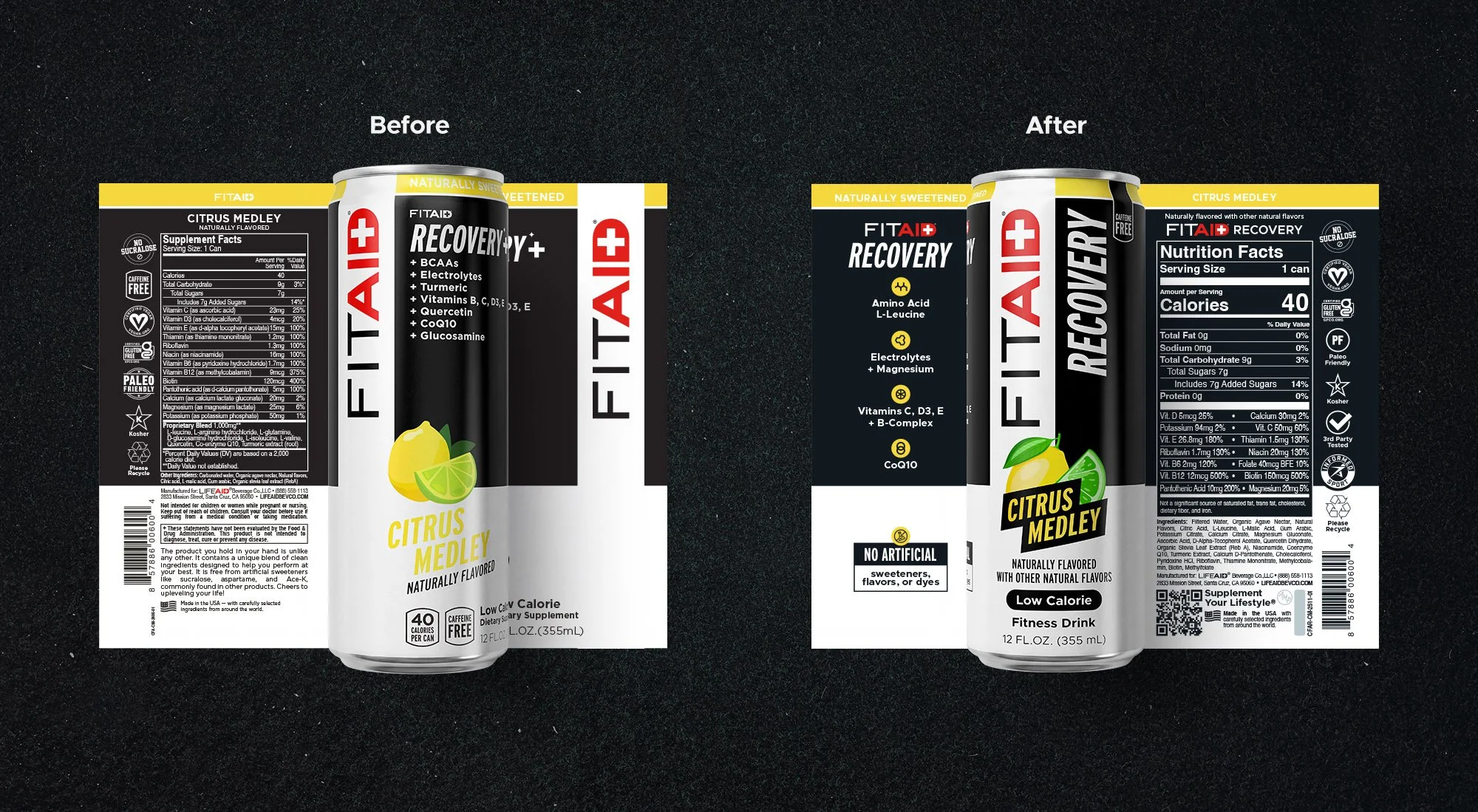
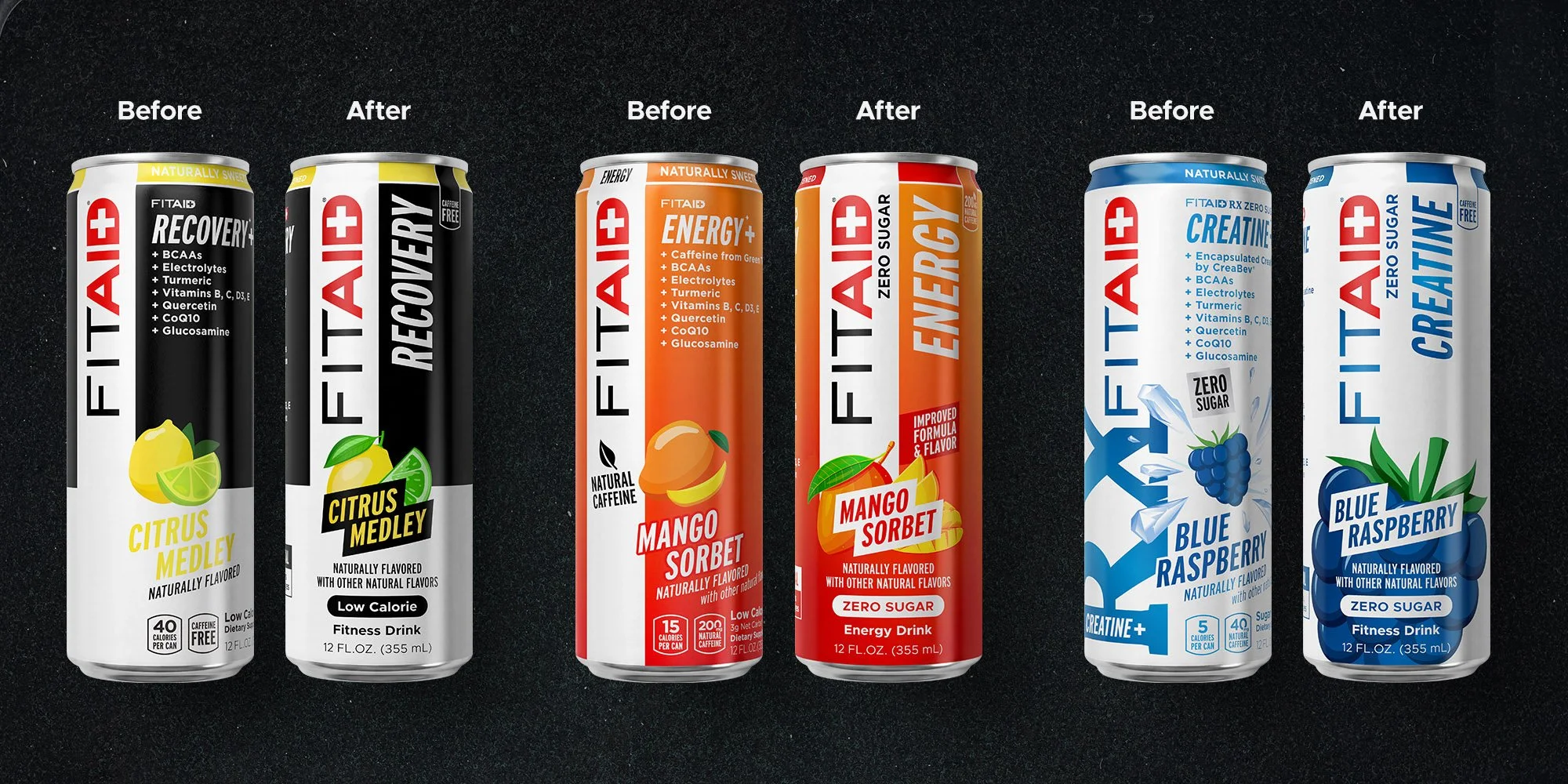
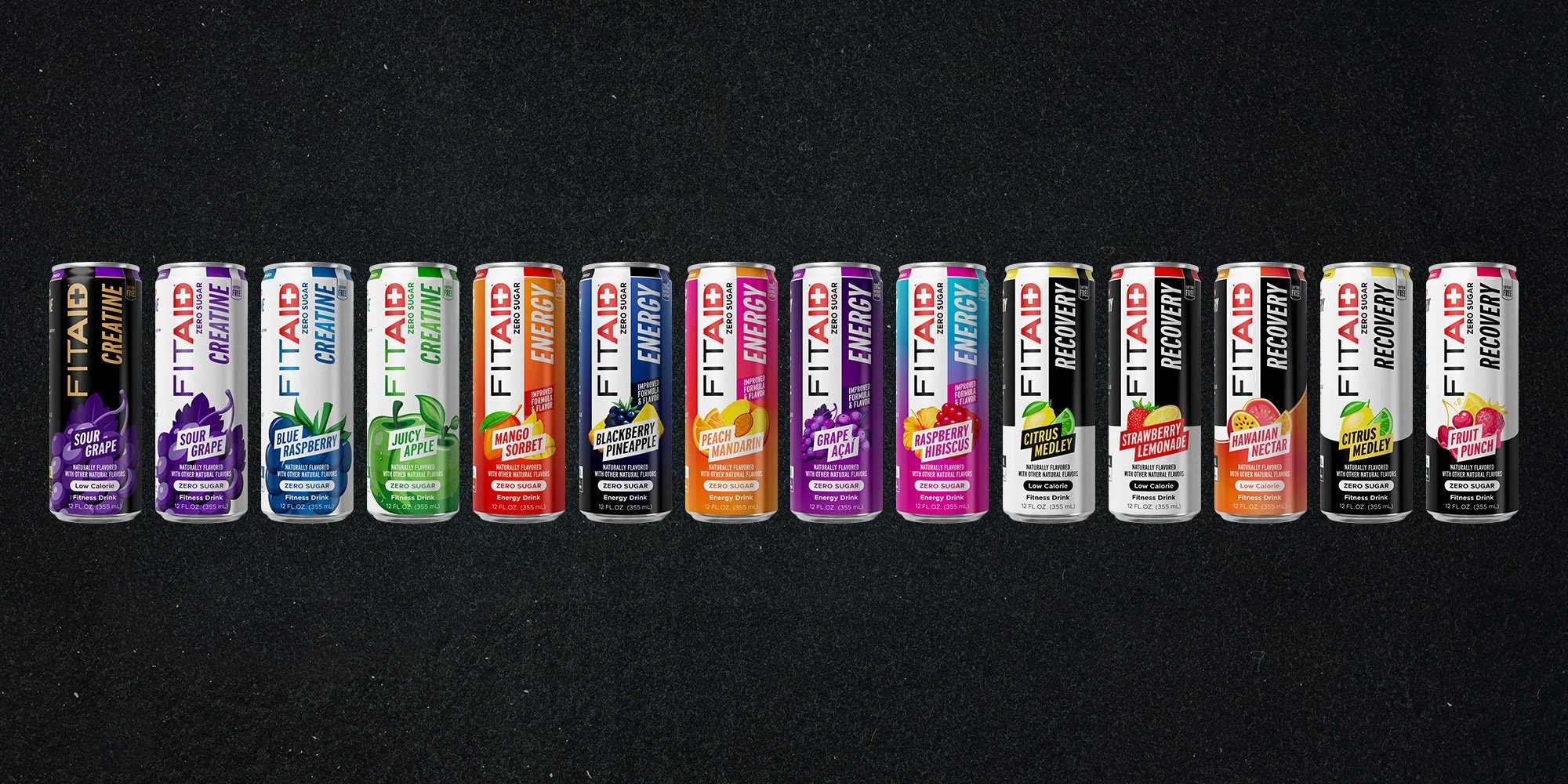
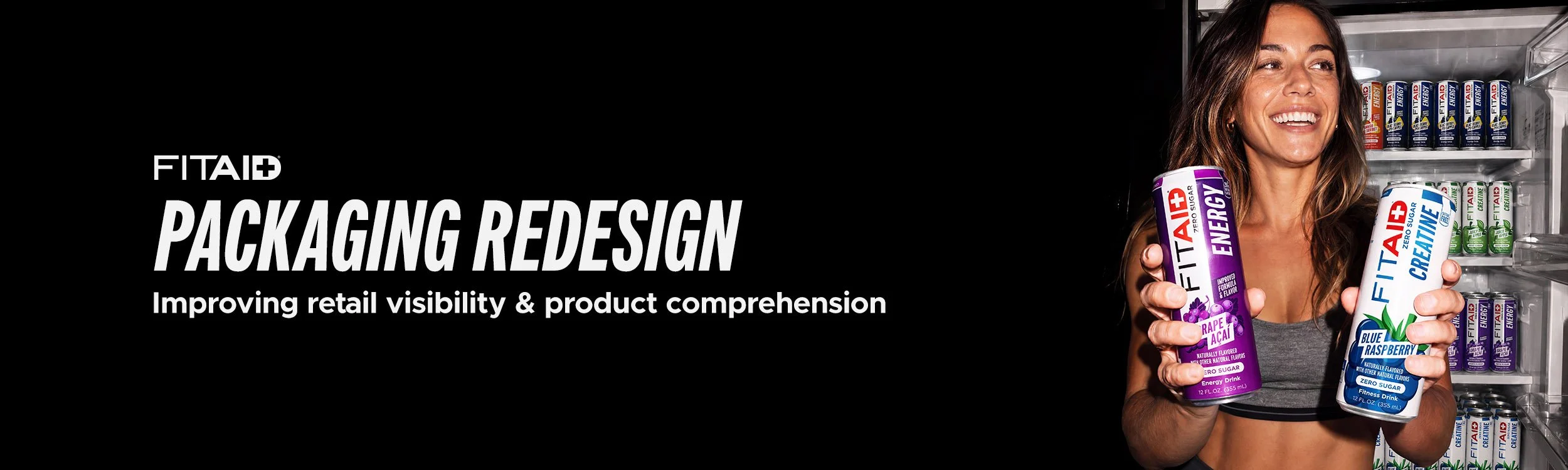
FITAID had grown to fourteen SKUs across three product lines, but the packaging had evolved one can at a time. Energy, Recovery, and Creatine used different visual systems, making the lineup feel more like separate products than one brand. The cans also lacked a clear primary face, so an imperfectly rotated can could lose the information shoppers needed most. And as formulas became more complex, front-panel benefit claims had accumulated into a dense wall of type that disappeared at shelf distance.
THE SOLUTION
I rebuilt the entire line around one question: what does a shopper need to understand in the second before the cooler door closes?
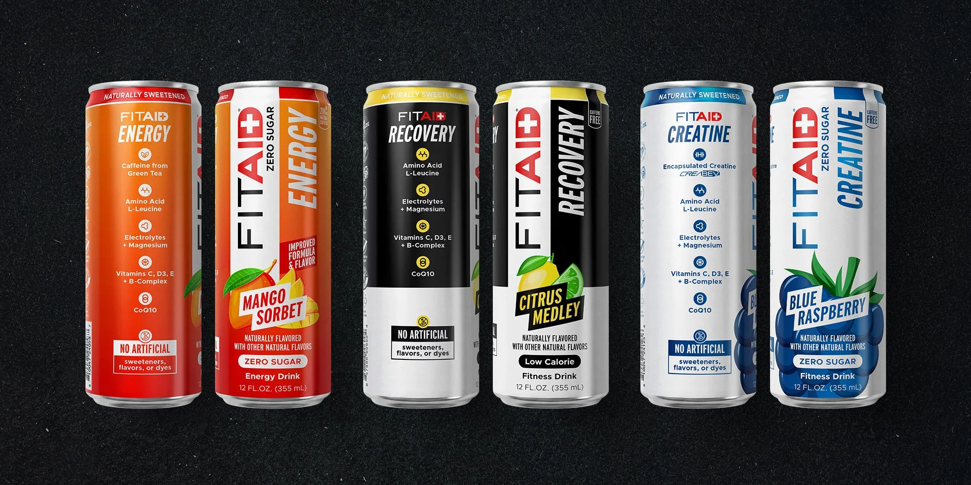
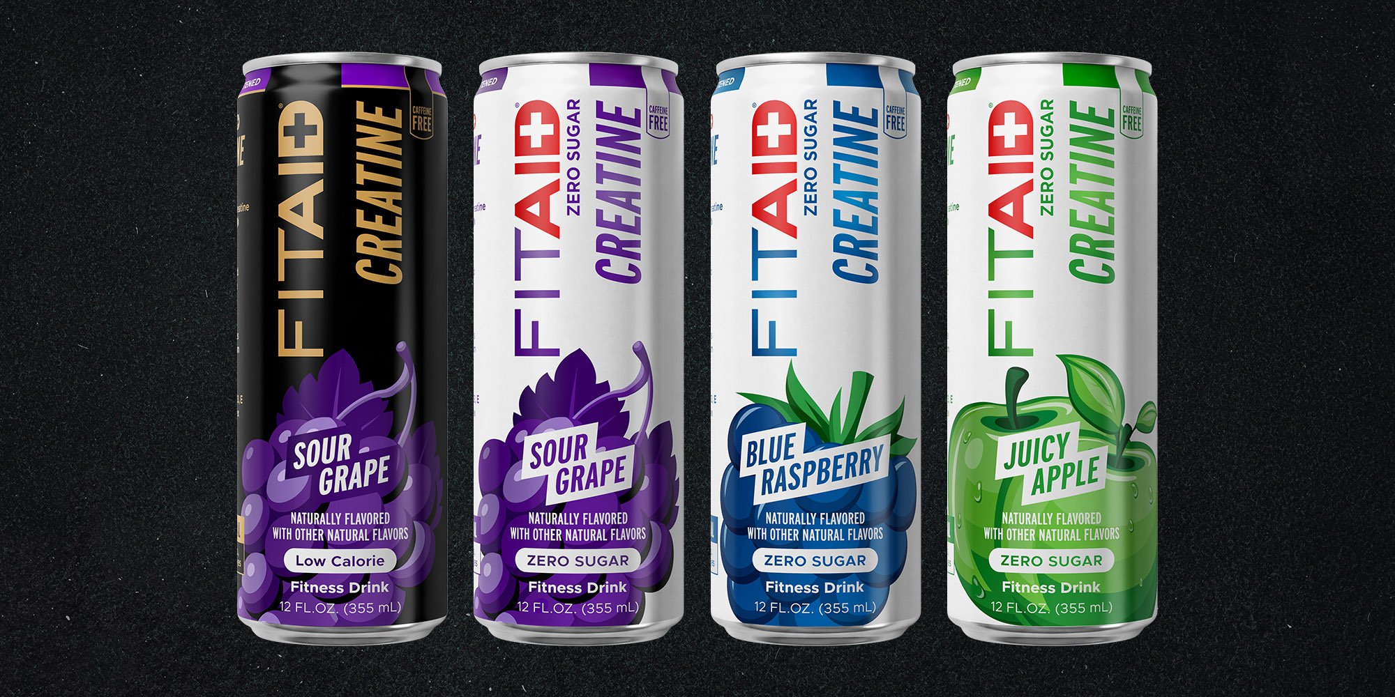
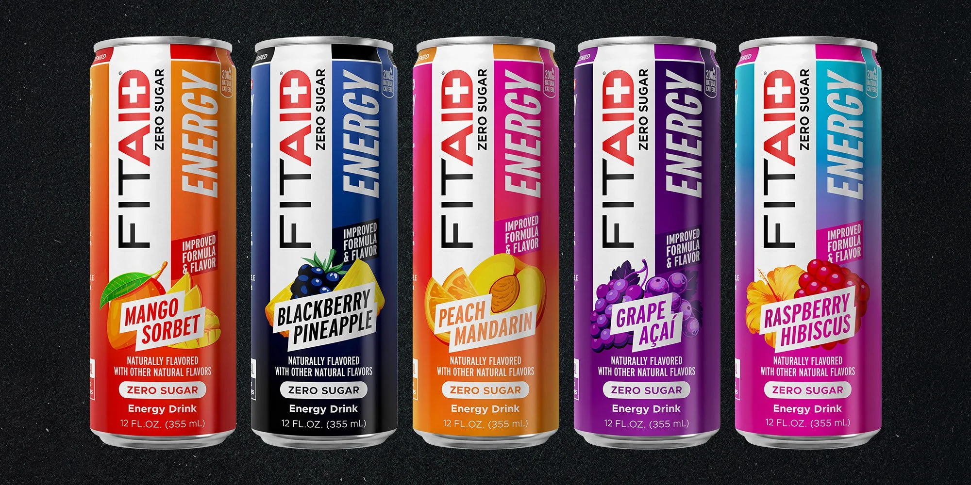
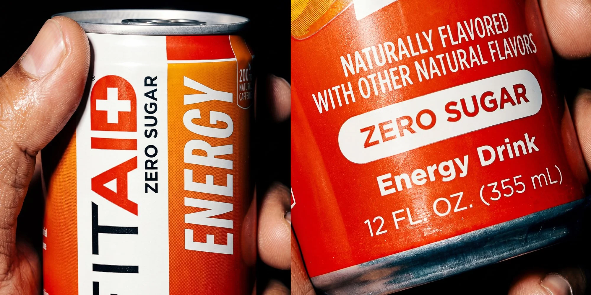
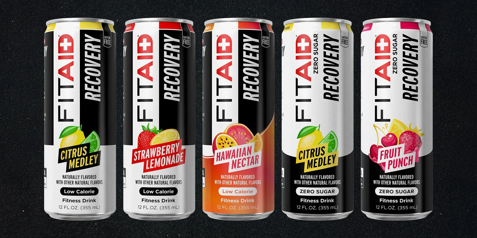
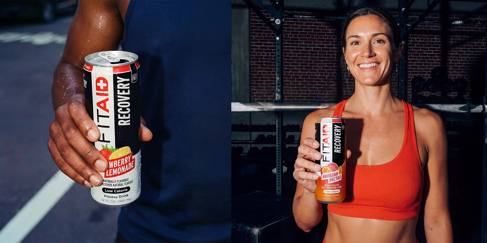
That led to a consistent hierarchy across every SKU: brand, function, flavor, then supporting information. ENERGY, RECOVERY, and CREATINE became large vertical identifiers alongside the FITAID mark, giving each can an immediate read while establishing a recognizable architecture across the full line.
From there, the system became modular. Flavor artwork, flavor name, dietary callout, drink type, and size occupy the same fixed zone on every can, allowing fourteen very different SKUs to behave as one family without forcing the layout to change from flavor to flavor.
The formula story moved off the front rather than disappearing. Key benefits became a simple icon system on the side panel, while Nutrition Facts, certifications, and supporting details were organized on the reverse.
The result is a packaging system that feels unmistakably FITAID at a glance: clearer on shelf, easier to shop, and built to scale as the line grows.